In this tutorial we will perform trajectory analysis using monocle3. You can find out more about the theory behind trajectory analysis in our slide deck. We have already analysed the trajectory of our sample using the ScanPy toolkit in another tutorial: Trajectory Analysis using Python (Jupyter Notebook) in Galaxy. However, trajectory analysis is quite sensitive and some methods work better for specific datasets. In this tutorial, you will perform the same steps but using a different method for inferring trajectories. You will then compare the results, usability and outcomes! Sounds exciting, let’s dive into that!
Tools are frequently updated to new versions. Your Galaxy may have multiple versions of the same tool available. By default, you will be shown the latest version of the tool. This may NOT be the same tool used in the tutorial you are accessing. Furthermore, if you use a newer tool in one step, and try using an older tool in the next step… this may fail! To ensure you use the same tool versions of a given tutorial, use the Tutorial mode feature.
Open your Galaxy server
Click on the curriculum icon on the top menu, this will open the GTN inside Galaxy.
Navigate to your tutorial
Tool names in tutorials will be blue buttons that open the correct tool for you
Note: this does not work for all tutorials (yet)
You can click anywhere in the grey-ed out area outside of the tutorial box to return back to the Galaxy analytical interface
Warning: Not all browsers work!
We’ve had some issues with Tutorial mode on Safari for Mac users.
Try a different browser if you aren’t seeing the button.
Get data
We will continue to work on the case study data from a mouse model of fetal growth restriction Bacon et al. 2018 (see the study in Single Cell Expression Atlas and the project submission).
Monocle3 works great with annotated data, so we will make use of our annotated AnnData object, generated in the previous tutorial. So you see - all the hard work of processing data was not in vain! We will also need a ‘clean’ expression matrix, extracted from the AnnData object just before we started the processing.
You have two options for uploading these datasets. Importing via history is often faster.
To run Monocle, we need cell metadata, gene metadata, and an expression matrix file of genes by cells. (In theory, the expression matrix alone could do, but then we wouldn’t have all those useful annotations that we worked on so hard in the previous tutorials!). In order to get these files, we will extract the gene and cell annotations from our AnnData object.
Question
How many lines do you expect to be in the gene and cell metadata files?
If you click on the step with uploaded annotated AnnData file, you will see on a small preview that this object has 8605 observations and 15395 variables, so we expect to get a cell metadata file with 8605 lines and gene metadata file with 15395 lines (without headers of course!).
Hands-on: Extracting annotations
Inspect AnnDataTool: toolshed.g2.bx.psu.edu/repos/iuc/anndata_inspect/anndata_inspect/0.7.5+galaxy1 with the following parameters:
param-file“Annotated data matrix”: Annotated_AnnData
“What to inspect?”: Key-indexed observations annotation (obs)
Rename galaxy-pencil the observations annotation Extracted cell annotations (obs)
Inspect AnnDataTool: toolshed.g2.bx.psu.edu/repos/iuc/anndata_inspect/anndata_inspect/0.7.5+galaxy1 with the following parameters:
param-file“Annotated data matrix”: Annotated_AnnData
“What to inspect?”: Key-indexed annotation of variables/features (var)
Rename galaxy-pencil the annotation of variables Extracted gene annotations (var)
Quick and easy, isn’t it? However, we need to make some minor changes before we can input these files into the Monocle toolsuite.
Cell metadata
Our current dataset is not just T-cells: as you might remember from the last tutorial, we identified a cluster of macrophages as well. This might be a problem, because the trajectory algorithm will try to find relationships between all the cells (even if they are not necessarily related!), rather than only the T-cells that we are interested in. We need to remove those unwanted cell types to make the analysis more accurate.
The Manipulate AnnData tool allows you to filter observations or variables, and that would be the most obvious way to remove those cells. However, given that we don’t need an AnnData object, it’s a lot quicker to edit a table rather than manipulate an AnnData object. Ultimately, we need cell metadata, gene metadata and expression matrix files that have macrophages removed, and that have the correct metadata that Monocle looks for. With some table manipulation, we’ll end up with three separate files, ready to be passed onto Monocle3.
Question
Where is the information about cell types stored?
We have already extracted the cell annotations file - in one of the columns you can find the information about cell type, assigned to each cell.
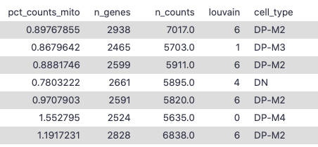
Figure 1: Example cell annotations
Click on Extracted cell annotations (obs) file to see a small preview window. This shows you that the column containing the cell types has number 22. We’ll need that to filter out unwanted cell types!
Warning: Check the column number!
If you are working on a different dataset, the number of the ‘cell_type’ column might be different, so make sure you check it on a preview and use the correct number!
Hands-on: Filter out macrophages
FilterTool: Filter1 with the following parameters:
That’s it - our cell annotation file is ready for Monocle! Let’s rename it accordingly.
Renamegalaxy-pencil the output: Cells input data for Monocle3
c22 means column no. 22 - that’s the column with cell types, and it will be filtered for the macrophages
!= means ‘not equal to’ - we want to keep the cell types which ARE NOT macrophages
It might happen that during clustering you’ll find another cell type that you want to get rid of for the trajectory analysis. Then simply re-run this tool on already filtered file and change ‘Macrophages’ to another unwanted cell type.
Gene annotations
Sometimes certain functionalities require a specific indication of where the data should be taken from. Monocle3 tools expect that the genes column is named ‘gene_short_name’. Let’s check what the name of that column is in our dataset currently.
Question
Where can you check the header of a column containing genes names?
What is the name of this column?
Our extracted gene annotations file! Either by clicking on the eye icon solution or having a look at the small preview window.
In our dataset the gene names are stored in a column called ‘Symbol’ - we need to change that!
Figure 2: Preview window in the history
Let’s click on the Extracted gene annotations (var) file to see a small preview. We can see that the gene names are in the third column with a header Symbol. Keep that in mind - we’ll use that in a second!
Hands-on: Changing the column name
Column Regex Find And ReplaceTool: toolshed.g2.bx.psu.edu/repos/galaxyp/regex_find_replace/regexColumn1/1.0.2 with the following parameters:
Click on the galaxy-pencilpencil icon for the dataset to edit its attributes
In the central panel, click on the galaxy-gearConvert tab on the top
In the lower part galaxy-chart-select-dataDatatypes, select tabular
tip: you can start typing the datatype into the field to filter the dropdown menu
Click the Save button
Voila! That’s the gene input for Monocle! Just a quick rename…
Renamegalaxy-pencil the output: Genes input data for Monocle3
Expression matrix
Last, but not least! And in fact, the most important! The expression matrix contains all the values representing the expression level of a particular gene in a cell. This is why in theory the expression matrix is the only input file required by Monocle3. Without annotation files the CDS data can still be generated - it will be quite bare and rather unhelpful for interpretation, but it’s possible to process.
So, the values in the expression matrix are just numbers. But do you remember that we have already done some processing such as normalisation and the calculation of principal components in the AnnData object in the previous tutorial? That affected our expression matrix. Preprocessing is one of the steps in the Monocle3 workflow, so we want to make sure that the calculations are done on a ‘clean’ expression matrix. If we apply too many operations on our raw data, it will be too ‘deformed’ to be reliable. The point of the analysis is to use algorithms that make the enormous amount of data understandable in order to draw meaningful conclusions in accordance with biology.
So how do we do that?
Question
How many cells and genes are there in the Anndata_before_processing file?
How many lines are there in Cells input data for Monocle3?
How many lines are there in Genes input data for Monocle3?
You can answer all the questions just by clicking on the given file and looking at the preview window.
[n_obs x n_vars] = 31178 x 35734, so there are 31178 cells and 35734 genes.
8570 lines, including a header, which makes 8569 cells.
15396 lines, including a header, which makes 15395 genes.
As you can see, there are way more genes and cells in the unprocessed AnnData file, so the expression matrix is much bigger than we need it to be. If the genes and cells we prepared for Monocle3 are not the same as in the expression matrix, Monocle3 will crash. Therefore, we have to filter that big, clean matrix and adjust it to our already prepared genes and cells files. But first, let’s extract the matrix from the unprocessed AnnData object.
Hands-on: Extracting matrix
Inspect AnnDataTool: toolshed.g2.bx.psu.edu/repos/iuc/anndata_inspect/anndata_inspect/0.7.5+galaxy1 with the following parameters:
param-file“Annotated data matrix”: AnnData_before_processing
“What to inspect?”: The full data matrix
Renamegalaxy-pencil the output: Unprocessed expression matrix
If you have a look at the preview of Unprocessed expression matrix, you’ll see that the first column contains the cell barcodes, while the first row - the gene IDs. We would like to keep only the values corresponding to the cells and genes that are included in Cells input data for Monocle3 and Genes input data for Monocle3. How do we do it? First, we compare the cell barcodes from Cells input data for Monocle3 to those in Unprocessed expression matrix and ask Galaxy to keep the values of the matrix for which the barcodes in both files are the same. Then, we’ll do the same for gene IDs. We will cut the first columns from Cells input data for Monocle3 and Genes input data for Monocle3 to be able to compare those columns side by side with the matrix file.
Hands-on: Cutting out the columns
CutTool: Cut1 with the following parameters:
“Cut columns”: c1
param-file“From”: Cells input data for Monocle3
Renamegalaxy-pencil the output: Cells IDs
CutTool: Cut1 with the following parameters:
“Cut columns”: c1
param-file“From”: Genes input data for Monocle3
Renamegalaxy-pencil the output: Genes IDs
Hands-on: Filter matrix values by cell barcodes
Join two DatasetsTool: join1 with the following parameters:
param-file“Join”: Cells IDs
“using column”: c1or Column: 1
param-file“with”: Unprocessed expression matrix
“and column”: c1or Column: 1
“Keep lines of first input that do not join with second input”: Yes
“Keep lines of first input that are incomplete”: Yes
“Fill empty columns”: No
“Keep the header lines”: Yes
Renamegalaxy-pencil the output: Pre-filtered matrix (by cells)
Look at the preview of the output file. First of all, you can see that there are 8570 lines (8569 cells) instead of 31178 cells that were present in the matrix. That’s exactly what we wanted to achieve - now we have raw information for the T-cells that we have filtered. However, the step that we have already performed left us with the matrix whose first and second columns are the same - let’s get rid of one of those!
Hands-on: Remove duplicate column (cells IDs)
Advanced CutTool: toolshed.g2.bx.psu.edu/repos/bgruening/text_processing/tp_cut_tool/1.1.0 with the following parameters:
param-file“File to cut”: Pre-filtered matrix (by cells)
“Operation”: Discard
“Cut by”: fields
“List of Fields”: c1
Renamegalaxy-pencil the output: Filtered matrix (by cells)
Now we will perform the same steps, but for gene IDs. But gene IDs are currently in the first row, so we need to transpose the matrix, and from there we can repeat the same steps as above for Gene IDs.
Hands-on: Filter matrix by gene IDs
TransposeTool: toolshed.g2.bx.psu.edu/repos/iuc/datamash_transpose/datamash_transpose/1.1.0+galaxy2 with the following parameters:
The matrix is now ready to be filtered by gene IDs!
Join two DatasetsTool: join1 with the following parameters:
param-file“Join”: Genes IDs
“using column”: c1 or Column: 1
param-file“with”: output of Transposetool
“and column”: c1 or Column: 1
“Keep lines of first input that do not join with second input”: Yes
“Keep lines of first input that are incomplete”: Yes
“Fill empty columns”: No
“Keep the header lines”: Yes
Advanced CutTool: toolshed.g2.bx.psu.edu/repos/bgruening/text_processing/tp_cut_tool/1.1.0 with the following parameters:
param-file“File to cut”: output of Join two Datasetstool
“Operation”: Discard
“Cut by”: fields
“List of Fields”: c1
Monocle3 requires that in the matrix rows are genes, and columns are cells - that is what we’ve got, so there is no need to transpose matrix again. The expression matrix is ready! Let’s just rename it…
Renamegalaxy-pencil the output: Expression matrix for Monocle3
congratulations Finally! We have prepared all the files to pass them onto the Monocle3 workflow!
Monocle3 workflow
Monocle3 turns the expression matrix, cell and gene annotations into an object called cell_data_set (CDS), which holds single-cell expression data.
expression_matrix: a numeric matrix of expression values, where rows are genes, and columns are cells. Must have the same number of columns as the cell_metadata has rows and the same number of rows as the gene_metadata has rows.
cell_metadata: a data frame, where rows are cells, and columns are cell attributes (such as cell type, culture condition, day captured, etc.)
gene_metadata: a data frame, where rows are features (e.g. genes), and columns are gene attributes, such as biotype, gc content, etc. One of its columns should be named “gene_short_name”, which represents the gene symbol or simple name (generally used for plotting) for each gene.
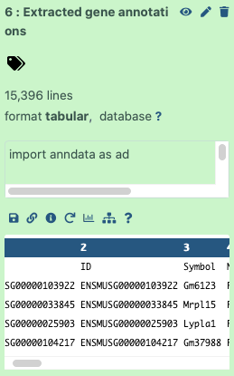
The Monocle3 workflow looks like the following, which should seem pretty similar to what you’ve done throughout the case study.
Figure 3: Workflow provided by Monocle3 documentation
We will follow those steps and see how it all works in practice.
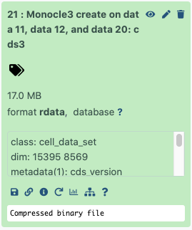
Hands-on: Create CDS object
You can provide expression matrix as TSV, CSV, MTX or RDS file, while genes and cells metadata as TSV, CSV or RDS files. In our case all three files are tabular, so we will set the format to TSV.
Monocle3 createTool: toolshed.g2.bx.psu.edu/repos/ebi-gxa/monocle3_create/monocle3_create/0.1.4+galaxy2 with the following parameters:
param-file“Expression matrix, genes as rows, cells as columns. Required input. Provide as TSV, CSV or RDS.”: Expression matrix for Monocle3
“Format of expression matrix”: TSV
param-file“Per-cell annotation, optional. Row names must match the column names of the expression matrix. Provide as TSV, CSV or RDS.”: Cells input data for Monocle3
“Format of cell metadata”: TSV
param-file“Per-gene annotation, optional. Row names must match the row names of the expression matrix. Provide as TSV, CSV or RDS.”: Genes input data for Monocle3
“Format of gene annotation”: TSV
Question
What are the dimensions of the created CDS object?
Just click on the performed step - on the preview you’ll see that the dimensions are 15395 x 8569 - so exactly as we predicted genes x cells!
Figure 4: Monocle Object Dimensions
Pre-processing
In Galaxy, there are currently 2 methods of initial dimensionality reduction included in the pre-processing step: principal component analysis (PCA) and latent semantic indexing (LSI).
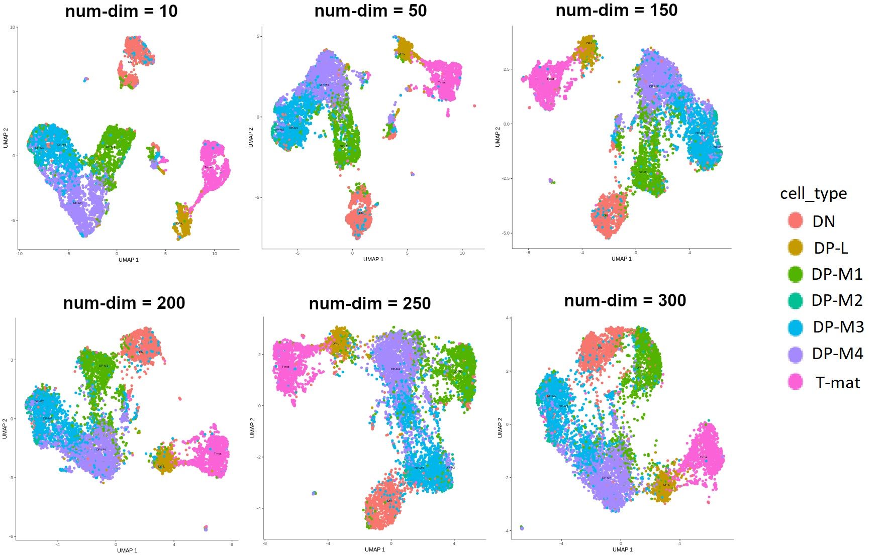
Given that PCA is more commonly used, and it allows us to perform further steps on the CDS object, we’ll use this method. There is one parameter here that has a great impact on how our analysis will look - the dimensionality of the initially reduced space. This is a highly subjective choice - you will want to test a lot of different parameters on your dataset. After much trial and error, we were able to find the value that made the most sense biologically. Have a look at the image below to see how different values affect the outcomes.
Figure 5: Different outputs depending on the number of dimensions that the space was reduced to during pre-processing. Currently the label size in Monocle graphs in Galaxy is a nightmare, so for clarity additional legend was added to this image. We're working on the label size so that you can generate clear, readable and pretty graphs. However in this particular figure, the main point is to show the differences in shapes depending on the num-dim.
Question
Looking at the image above, which value would you choose?
It might be hard to tell at this point without any explanation! Don’t worry, after a few more steps you’ll understand what all those colors mean and how to generate those plots. But look - we want to infer trajectories and find relationships between cells, ideally we would see the development of cells or transition from one type to another. In the graphs where num-dim is from 10 to 200, you see that the clusters are quite disjoint, while we want to see smooth transitions from one to another. I can tell you now that we’ll go ahead with the value of 250. We’re not choosing 300, because the arrangement of the cells on that graph is not really biologically relevant.
Hands-on: Pre-processing
Monocle3 preprocessTool: toolshed.g2.bx.psu.edu/repos/ebi-gxa/monocle3_preprocess/monocle3_preprocess/0.1.4+galaxy0 with the following parameters:
param-file“Input object in RDS format”: output of Monocle3 createtool
“The dimensionality of the reduced space.”: 250
Dimensionality reduction
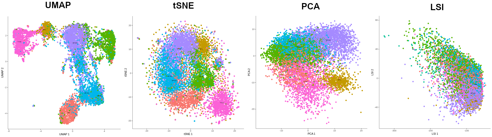
Now it’s time for the proper dimensionality reduction, to turn the original thousands of dimensions (genes), into a 2-dimensional graph. There are several algorithms to do this: UMAP, tSNE, PCA and LSI (only possible when preprocess_method is set to LSI), but due to the same reasons as above, we’ll use UMAP (most common + allows further operations + best results). But I’ll let you see how the outputs from the other algorithms look to convince you that UMAP is indeed the best for this dataset. Of course, it’s possible that by choosing different pre-processing values, tSNE or PCA plots would look better, so don’t be afraid to play around with the parameters and test them!
Figure 6: The preview of alignment of cell types depending on the algorithm of dimensionality reduction that was chosen: UMAP, tSNE, PCA, LSI. The methods were applied to the output of the PCA-preprocessed data (except LSI method which was called on LSI-preprocessed data). LSI failed in forming distinct cell groups, PCA managed to cluster cells according to their types but tSNE did it more precisely. However, UMAP gave the best results, not only showing distinct cell type groups, but also ordering them in a way that makes sense biologically - DN to T-mat.
Hands-on: Dimensionality reduction
Monocle3 reduceDimTool: toolshed.g2.bx.psu.edu/repos/ebi-gxa/monocle3_reducedim/monocle3_reduceDim/0.1.4+galaxy0 with the following parameters:
param-file“Input object in RDS format”: output of Monocle3 preprocesstool
Plotting
Alright, now let’s have a look at our output! Above you got a sneak peek of how the plot would look, but now you’ll generate the plots on your own!
Thanks to the fact that we provided Monocle3 with annotated data, we can now color the cells by any attribute that was in the cell metadata file! Similarly to the previous tutorial, we’ll color them by cell type, genotype, batch and sex. At least for now…
Hands-on: Plotting
Monocle3 plotCellsTool: toolshed.g2.bx.psu.edu/repos/ebi-gxa/monocle3_plotcells/monocle3_plotCells/0.1.5+galaxy1 with the following parameters:
param-file“Input object in RDS format”: output of Monocle3 reduceDimtool
“The cell attribute (e.g. the column of pData(cds)) to map to each cell’s color, or one of {cluster, partition, pseudotime}.”: cell_type
“If set, display the cell group names directly on the plot. Otherwise include a color legend on the side of the plot.”: history-shareNo
Rename galaxy-pencil the output: Cell type plot
Monocle3 plotCellsTool: toolshed.g2.bx.psu.edu/repos/ebi-gxa/monocle3_plotcells/monocle3_plotCells/0.1.5+galaxy1 with the following parameters:
param-file“Input object in RDS format”: output of Monocle3 reduceDimtool
“The cell attribute (e.g. the column of pData(cds)) to map to each cell’s color, or one of {cluster, partition, pseudotime}.”: genotype
“If set, display the cell group names directly on the plot. Otherwise include a color legend on the side of the plot.”: history-shareNo
Rename galaxy-pencil the output: Genotype plot
Monocle3 plotCellsTool: toolshed.g2.bx.psu.edu/repos/ebi-gxa/monocle3_plotcells/monocle3_plotCells/0.1.5+galaxy1 with the following parameters:
param-file“Input object in RDS format”: output of Monocle3 reduceDimtool
“The cell attribute (e.g. the column of pData(cds)) to map to each cell’s color, or one of {cluster, partition, pseudotime}.”: batch
“If set, display the cell group names directly on the plot. Otherwise include a color legend on the side of the plot.”: history-shareNo
Rename galaxy-pencil the output: Batch plot
Monocle3 plotCellsTool: toolshed.g2.bx.psu.edu/repos/ebi-gxa/monocle3_plotcells/monocle3_plotCells/0.1.5+galaxy1 with the following parameters:
param-file“Input object in RDS format”: output of Monocle3 reduceDimtool
“The cell attribute (e.g. the column of pData(cds)) to map to each cell’s color, or one of {cluster, partition, pseudotime}.”: sex
“If set, display the cell group names directly on the plot. Otherwise include a color legend on the side of the plot.”: history-shareNo
Rename galaxy-pencil the output: Sex plot
The Previous tutorial discussed in detail the biological interpretation of data, so we will quickly go through similar analysis to see if the results are consistent and if we can draw any new conclusions.
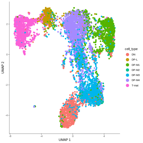
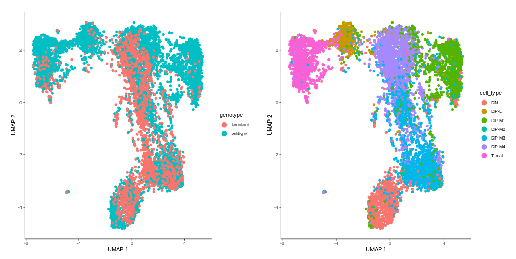
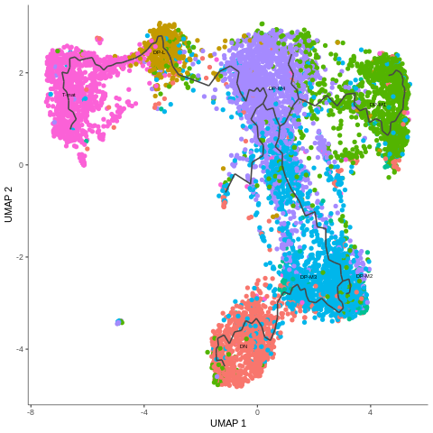
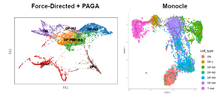
As a reminder, here’s the comparision between cell type annotation done in the other tutorial using Scanpy, and the output from the previous step of this Monocle tutorial. The main difference is that Scanpy was used to identify the cell types and assign them to clusters. That data was then passed on to Force-Directed + PAGA algorithms to infer trajectory, and then the arrangement of the cell groups changed a bit. In Monocle, trajectory analysis will be based on the clustering you see now.
Figure 7: Cells coloured in Monocle by their type.
In the mentioned tutorial, we annotated the cells so that we know what type they are. Above you can see how Monocle used this information to colour cells by their type. It is important to see the ‘form’ of the graph and how the cell types are arranged within its confines. But why is it important? Well, in Monocle, our trajectory analysis will be based on the same arrangement of the cells that you see now. And if you now recall our choice of the number of dimensions during pre-processing, you’ll understand why it was crucial - choosing the right value at the beginning determines the ‘shape’ of the graph that is then retained for the trajectory analysis. Therefore, the fact that on the plot above we clearly see DN cells on one side of the graph and T-mat on the other, going through DP cells, looks promising. But there is DP-M1 group that suspiciously branches out… Let’s investigate that and wait until the trajectory is inferred!
Question: Genotype
Based on our results, can we confirm findings from the previous tutorial that DP-L and mature T-cells (particularly the top half) are missing some knockout cells?
Figure 8: Genotype differences
Indeed, that’s what we see in our graph! But look closer, there is something more…Additionally, we also discovered that the vast majority of DP-M1 is only wildtype cells. That’s interesting, isn’t it?
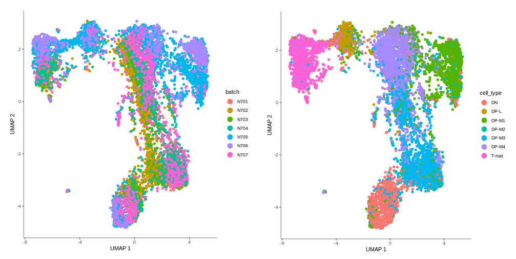
Question: Batch effect
Can we confirm the previous findings that DP-L looks to be mainly comprised of N705?
Figure 9: Checking for batch effect
Both DP-L and DP-M1 seem to consist mostly of N705 and N706. There might be indeed a bit of batch effect, so you could consider using batch correction on this dataset. In the absence of batch correction, we will focus on those clusters where there is batch mixing for biological interpretation. Finally, we will look at the confounding effect of sex.
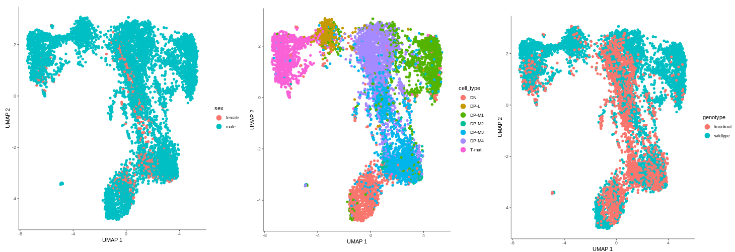
Figure 10: Sex distribution across the sample
There are also no female cells in DP-L and DP-M1. The one female sample - which is one of the mere three knockout samples - seems to be distributed in the same areas as the knockout samples at large. Luckily, this doesn’t seem to be a confounding factor and we can still learn from our data.
Clustering
Don’t get confused - we haven’t clustered our cells yet, for now we have only plotted them based on cell type annotation. Now it’s time to create clusters, which - in an ideal world where all computation picks up the exact biological phenomenons - would yield the same areas as the clusters determined by the Scanpy algorithms. Is this the case here? Do Monocle and Scanpy identify the same clusters?
Monocle uses a technique called “community detection” (Traag et al. 2019) to group cells. This approach was introduced by Levine et al. 2015 as part of the phenoGraph algorithm.
Monocle also divides the cells into larger, more well separated groups called partitions, using a statistical test from Wolf et al. 2019, introduced as part of their PAGA algorithm.
Clusters are particularly useful while trying to assign cells to a certain type, because they are based on the similarity in gene expression. The relationships between different clusters are analysed to identify possible trajectories.
Partitions, meanwhile, are larger groups of cells that usually contain several clusters. Trajectory inference is performed only within one partition, so it is essential that all the cells that we want to analyse in pseudotime belong to the same partition.
Hands-on: Clustering
Monocle3 partitionTool: toolshed.g2.bx.psu.edu/repos/ebi-gxa/monocle3_partition/monocle3_partition/0.1.4+galaxy0 with the following parameters:
param-file“Input object in RDS format”: output of Monocle3 reduceDimtool
“Resolution of clustering result, specifying the granularity of clusters. Not used by default and the standard igraph louvain clustering algorithm will be used.”: 0.00015
“The q-value threshold used to determine the partition of cells.”: 1.0
The clusters and partitions are now stored in your CDS file. To see them, just plot the output, coloring the cells with the corresponding attributes.
Monocle3 plotCellsTool: toolshed.g2.bx.psu.edu/repos/ebi-gxa/monocle3_plotcells/monocle3_plotCells/0.1.5+galaxy1 with the following parameters:
param-file“Input object in RDS format”: output of Monocle3 partitiontool
“The cell attribute (e.g. the column of pData(cds)) to map to each cell’s color, or one of {cluster, partition, pseudotime}.”: partition
Rename galaxy-pencil the output: Partition plot
Monocle3 plotCellsTool: toolshed.g2.bx.psu.edu/repos/ebi-gxa/monocle3_plotcells/monocle3_plotCells/0.1.5+galaxy1 with the following parameters:
param-file“Input object in RDS format”: output of Monocle3 partitiontool
“The cell attribute (e.g. the column of pData(cds)) to map to each cell’s color, or one of {cluster, partition, pseudotime}.”: cluster
Rename galaxy-pencil the output: Cluster plot
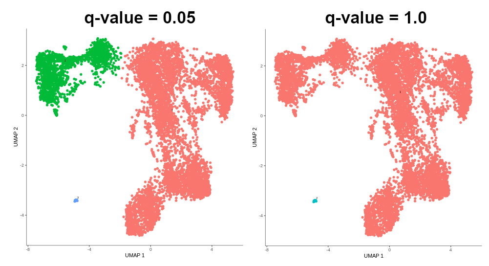
Sometimes it might happen that cells are grouped into several partitions, while you want them all to be in just one in order to perform trajectory analysis on all of them. Then, you can try to increase the q-value threshold that is used to determine the partition of cells.
Figure 11: q-value threshold affecting the span of partition. Note that 0.05 is the default value.
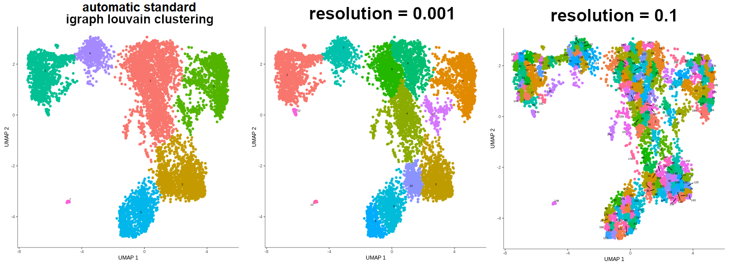
When using standard igraph louvain clustering, the value of resolution parameter is by default set to NULL, which means that it is determined automatically. If you are not satisfied with the results of the standard igraph louvain clustering, you may set the resolution value manually, and thus specify the granularity of the clustering.
Figure 12: Different granularity of clusters based on the resolution set automatically and manually.
Warning: Ambiguous clusters!
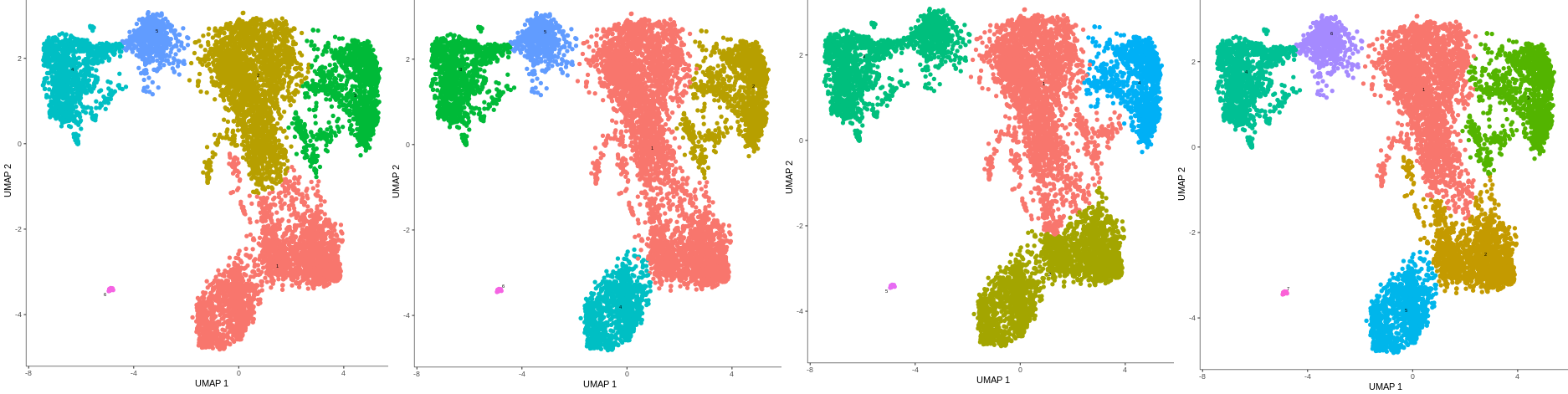
As mentioned above, standard igraph louvain clustering determines the resolution automatically, unless the specific value is provided by the user. Therefore, it sometimes returns slightly different outputs. To ensure that your clusters are reproducible, you might want to pass a certain value to the resolution parameter. In case of our data, the resolution value of 0.00015 gave the same results as the best output of igraph louvain clustering, and ensured reproducibility.
Figure 13: Standard igraph louvain clustering giving different results despite the same input becasue of the automatic determination of resolution vaule.
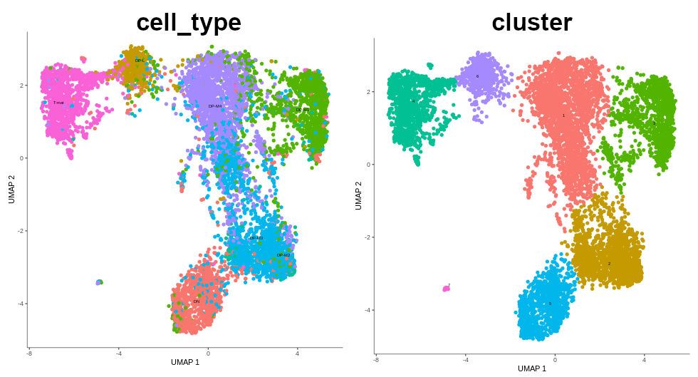
If we compare the annotated cell types and the clusters that were just formed, we see that they nicely correspond to one another.
Figure 14: Comparision between annotated cell types and formed clusters.
Gene expression
We haven’t looked at gene expression yet! This step is particularly important when working with data which is not annotated. Then, based on the expression of marker genes, you are able to identify which clusters correspond to which cell types. This is indeed what we did in the previous tutorial using scanpy. We can do the same using Monocle3! Since we work on annotated data, we can directly check if the expressed genes actually correspond to the previously assigned cell types. If they do, that’s great - if two different methods are consistent, that gives us more confidence that our results are valid.
Below is the table that we used in the previous tutorial to identify the cell types.
Marker
Cell type
Il2ra
Double negative (early T-cell)
Cd8b1, Cd8a, Cd4
Double positive (middle T-cell)
Cd8b1, Cd8a, Cd4 - high
Double positive (late middle T-cell)
Itm2a
Mature T-cell
Aif1
Macrophages
Hba-a1
RBC
Hands-on: Gene expression
Monocle3 plotCellsTool: toolshed.g2.bx.psu.edu/repos/ebi-gxa/monocle3_plotcells/monocle3_plotCells/0.1.5+galaxy1 with the following parameters:
param-file“Input object in RDS format”: output of Monocle3 partitiontool
“The cell attribute (e.g. the column of pData(cds)) to map to each cell’s color, or one of {cluster, partition, pseudotime}.”: cell_type
“A list of gene IDs/short names to plot.”: Il2ra,Cd8b1,Cd8a,Cd4,Itm2a,Aif1,Hba-a1
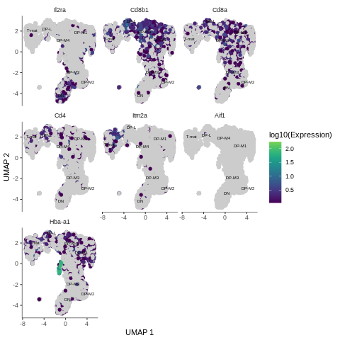
Figure 15: Expression of the genes across analysed sample
Question: Genes and cell types
Based on the gene expression graph that we just generated, the table above and your knowledge from the previous tutorial, how would you interpret the results?
Il2ra: expressed in the cluster where DN cells are - an indication of where the trajectory should start
Cd8b1, Cd8a: expressed in the areas where middle DP were assigned - great
high Cd4: mostly in late DP cluster - as expected
Itm2a: expressed in mature T-cells - tells us where the trajectory should end
Aif1: nothing here - correct! We filtered out macrophages from the sample
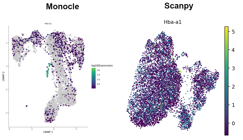
Hba-a1: look at this! Very high expression in just one, tiny bit, which hasn’t even been grouped into a cluster! So wait, why do we see hemoglobin gene here? Do we have red blood cells in our sample?! Let’s investigate that further…
The Hba-a1 gene creates hemoglobin which is found in red blood cells. This is highly expressed in a tiny bit of the middle DP cluster. Interestingly, it forms a a clearly visible, distinct, little branch. Hemoglobin should NOT be found in T-cells. However, if you remember, the gene was found to be expressed in the previous Scanpy tutorial (see the image below). That marker appeared throughout the entire sample in low numbers, suggesting some background contamination of red blood cell debris in the cell samples during library generation. Unlike Scanpy, Monocle algorithms allowed us to gather the cells expressing that gene into a distinct group! That’s great!
Figure 16: Hemoglobin across clusters - comparision between Monocle and Scanpy
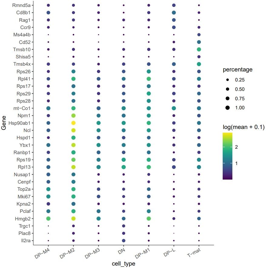
Top marker genes
Here we used a priori knowledge regarding the marker genes. If we wanted to approach this problem in an unsupervised manner, we could use Monocle to tell us the top marker genes in each group of cells. This is very useful if we are trying to identify a cell type, or if we want to find novel marker genes for known cell types.
Question
If I cluster cells that are not annotated, can I assign clusters to a cell type based on gene expression using Monocle3?
Theoretically…yes! That’s the point of the clustering and gene expression analysis. However, as of the writing of this tutorial, this function hasn’t been turned into a Galaxy tool yet and is only available in R.
Hands-on: Top marker genes
Monocle3 top markersTool: toolshed.g2.bx.psu.edu/repos/ebi-gxa/monocle3_topmarkers/monocle3_topmarkers/0.1.5+galaxy0 with the following parameters:
param-file“Input Object”: output of Monocle3 partitiontool
“Group cell by”: cell_type
Rename galaxy-pencil the tabular output: Top markers table
Rename galaxy-pencil the pdf output: Top markers plot
Figure 17: Identification of the genes most specifically expressed in groups of cells.
Question
What genes are uniquely expressed in DP-M1?
By looking at the table, you might give the 5 top gene IDs expressed in DP-M1. To save you some time and make the analysis more readable, we converted the gene IDs to gene names and they are as follows: Rps17, Rpl41, Rps26, Rps29, Rps28. They are all ribosomal! [You can do this yourself if you want by following this section of a previous tutorial that uses the gene names in one object to add to a table of Ensembl IDs. These ribosomal differences might be due to housekeeping background, cell cycling, or even something more bioligically interesting…or all three!
The plot also indicates other specifically expressed genes, such as Hmgb2, Pclaf, Rpl13, Rps19, Ybx1, Ncl, Hsp90ab1, Npm1.
Whenever you want to explore what might be the function of a particular cluster or why it branches out from the trajectory, check the top markers for that cluster to draw biological conclusions. Thank you Maths!
But what if you want to know how gene expression changes across a trajectory? This is where Monocle is particularly powerful. But in order to do that, we have to infer that trajectory first!
Learn the trajectory graph
We’re getting closer and closer! The next step is to learn the trajectory graph, which means to fit a principal graph within each partition. In that way, we’ll ‘connect’ the existing clusters by creating a path between them.
Hands-on: Learn graph
Monocle3 learnGraphTool: toolshed.g2.bx.psu.edu/repos/ebi-gxa/monocle3_learngraph/monocle3_learnGraph/0.1.4+galaxy0 with the following parameters:
param-file“Input object in RDS format”: output of Monocle3 partitiontool
Again, the graph is now stored in your CDS file. To see it, just plot the output, you can color the cells by any attribute that you want. We’ll use cell types to see how they are connected.
Monocle3 plotCellsTool: toolshed.g2.bx.psu.edu/repos/ebi-gxa/monocle3_plotcells/monocle3_plotCells/0.1.5+galaxy1 with the following parameters:
param-file“Input object in RDS format”: output of Monocle3 learnGraphtool
“The cell attribute (e.g. the column of pData(cds)) to map to each cell’s color, or one of {cluster, partition, pseudotime}.”: cell_type
As you can see, the learned trajectory path is just a line connecting the clusters. However, there are some important points to understand here.
If the resolution of the clusters is high, then the trajectory path will be very meticulous, strongly branched and curved. There’s a danger here that we might start seeing things that don’t really exist.
You can set an option to learn a single tree structure for all the partitions or use the partitions calculated when clustering and identify disjoint graphs in each. To make the right decision, you have to understand how/if the partitions are related and what would make more biolgical sense. In our case, we were only interested in a big partition containing all the cells and we ignored the small ‘dot’ classified as another partition.
There are many trajectory patterns: linear, cycle, bifurcation, tree and so on. Those patterns might correspond to various biological processes: transition events for different phases, cell cycle, cell differentiation. Therefore, branching points are quite important on the trajectory path. You can always plot them, history-share checking the correct box in Monocle3 plotCells.
Figure 18: Learned trajectory path
As a reminder, here’s the comparision between our trajectory and the one from the previous tutorial, where we used Scanpy for clustering, and then appplied Force-Directed + PAGA algorithms to infer trajectory. As you remember from those tutorials, the arrangement of the cell groups changed a bit during these steps. Indeed - by using the mentioned methods, we get different graphs for clusters and trajectory, while in Monocle the general ‘shape’ of the graph stays the same from the beginning. ‘Leranig the trajectory’ step in Monocle is about finding a path, along which the cells can be then ordered in pseudotime.
Figure 19: Comparison between the trajectory inferred in the previous 'case study' tutorials (Scanpy + Force-Directed + PAGA) and the trajectory obtained in Monocle.
Pseudotime analysis
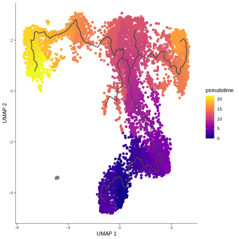
Finally, it’s time to see our cells in pseudotime! We have already learned a trajectory, now we only have to order the cells along it. Monocle3 requires information on where to start ordering the cells, so we need to provide it with this information. We annotated early T-cells as double negative (DN), so those will be our root cells!
To infer trajectories, we need data from cells at different points along a path of differentiation. The assumption is that in any given sample, some cells are further along a trajectory than others. This inferred temporal dimension is known as pseudotime. Pseudotime measures the cells’ progress through the transition. See Reid and Wernisch 2016 for more.
Hands-on: Ordering the cells along trajectory
Monocle3 orderCellsTool: toolshed.g2.bx.psu.edu/repos/ebi-gxa/monocle3_ordercells/monocle3_orderCells/0.1.4+galaxy0 with the following parameters:
param-file“Input object in RDS format”: output of Monocle3 learnGraphtool
“The cell phenotype (column in pdata) used to identify root principal nodes.”: cell_type
“The value in the cell phenotype column used to extract root nodes.”: DN
Alright - we were waiting for this plot the whole tutorial: once we have the cells ordered, we can finally color them by pseudotime!
Monocle3 plotCellsTool: toolshed.g2.bx.psu.edu/repos/ebi-gxa/monocle3_plotcells/monocle3_plotCells/0.1.5+galaxy1 with the following parameters:
param-file“Input object in RDS format”: output of Monocle3 orderCellstool
Rename galaxy-pencil the output: Pseudotime plot
The method to specify the root cells shown above is not the only one available in Galaxy! However, it is probably the most intuitive one.
Annotated cell type as root cells
fill (–cell-phenotype) with the colname (heading) where the cell types are stored
fill (–root-type) with the name of the cell type that you want to start ordering from
Cell ID as root cell
fill (–root-cells) with the cell ID that you want to start ordering from
Now we can see how all our hard work has come together to give a final pseudotime trajectory analysis. DN cells gently switching to DP-M which change into DP-L to finally become mature T-cells. Isn’t it beautiful? But wait, don’t be too enthusiastic - why on earth DP-M1 group branches out? We didn’t expect that… What could that mean?
There are a lot of such questions in bioinformatics, and we’re always get excited to try to answer them. However, with analysing scRNA-seq data, it’s almost like you need to know about 75% of your data to make sure that your analysis is reasonable, before you can identify the 25% new information. Additionally, pseudotime analysis crucially depends on choosing the right analysis and parameter values, as we showed for example with initial dimensionality reduction during pre-processing. The outputs here, at least in our hands, are more sensitive to parameter choice than standard clustering analysis with Scanpy.
Figure 20: Trajectory analysis - pseudotime
Last but not least, you can now identify genes that define the inferred trajectories.
Hands-on: Differentially expressed genes
Monocle3 diffExpTool: toolshed.g2.bx.psu.edu/repos/ebi-gxa/monocle3_diffexp/monocle3_diffExp/0.1.4+galaxy1 with the following parameters:
param-file“Input object in RDS format”: output of Monocle3 orderCellstool
Rename galaxy-pencil the output: Differential gene expression table
Conclusion
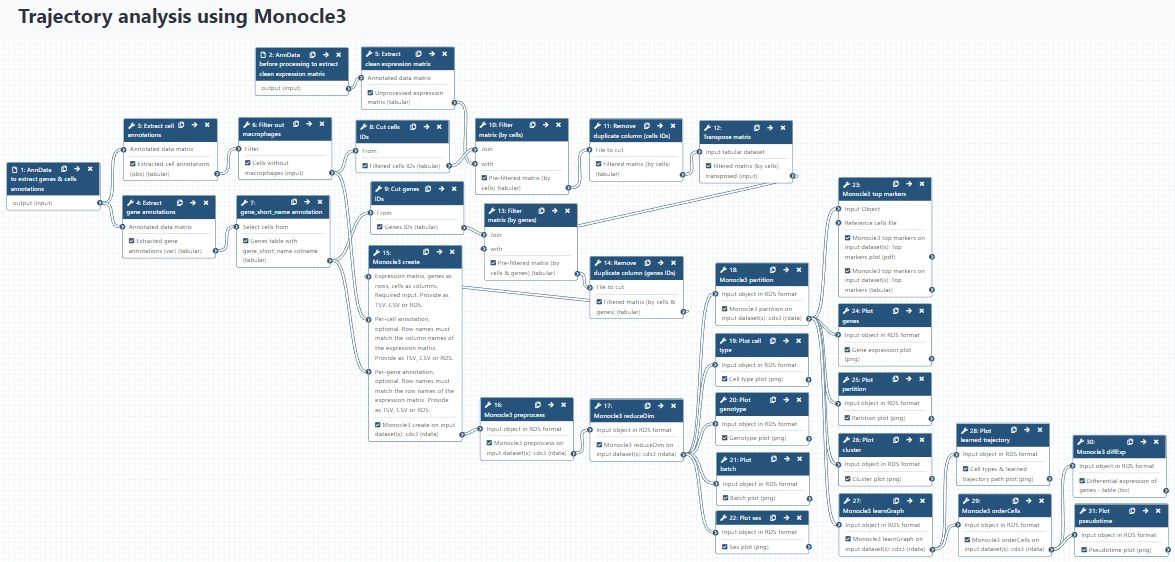
congratulations Well done, you’ve made it to the end! You might want to consult your results with this control history, or check out the full workflow for this tutorial. I also split this workflow into two separate workflows: preparing the input files for Monocle3, starting from AnnData, and Monocle3 only workflow. You can use them to accelerate analysis of your own data, paying attention to the requirements of the input data that are mentioned in this tutorial.
Figure 21: Full workflow for this tutorial.
If you’re following the Case Study tutorials from the beginning, you have already experienced what it’s like to analyse and question a dataset, potentially without clear cut-offs or clear answers. You now know that trajectory analysis is even more sensitive to parameter values, so it’s often trying to find the best set of values that would give the most reasonable results and go in accordance with biology. Moreover, not all trajectory analysis methods are designed to infer all kinds of biological processes - due to the fact that they use different algorithms, some would work better for analysing your sample. Since Monocle is quite widely used for trajectory analysis, it might be a good practice to compare its results with other methods. The more evidence you have to confirm your findings, the more confident you can be about their reliability!
Key points
You should understand your data object sufficiently to be able to extract relevant information for further analysis.
Trajectory analysis is highly dependent on the parameter values you choose, as such ‘inferred relationships’ are a bigger mathematical leap. Therefore, you should always check if the output makes biological sense before proceeding to the next step.
Comparing the output of two different methods applied on the same dataset might be useful to confirm the results, to ensure that the findings are reliable and even sometimes to find a new piece of information.
Further information, including links to documentation and original publications, regarding the tools, analysis techniques and the interpretation of results described in this tutorial can be found here.
References
Levine, J. H., E. F. Simonds, S. C. Bendall, K. L. Davis, E.-ad D. Amir et al., 2015 Data-Driven Phenotypic Dissection of AML Reveals Progenitor-like Cells that Correlate with Prognosis. Cell 162: 184–197. 10.1016/j.cell.2015.05.047
Reid, J. E., and L. Wernisch, 2016 Pseudotime estimation: deconfounding single cell time series. Bioinformatics 32: 2973–2980. 10.1093/bioinformatics/btw372
Bacon, W. A., R. S. Hamilton, Z. Yu, J. Kieckbusch, D. Hawkes et al., 2018 Single-Cell Analysis Identifies Thymic Maturation Delay in Growth-Restricted Neonatal Mice. Frontiers in Immunology 9: 10.3389/fimmu.2018.02523
Traag, V. A., L. Waltman, and N. J. van Eck, 2019 From Louvain to Leiden: guaranteeing well-connected communities. Sci Rep 9: 10.1038/s41598-019-41695-z
Wolf, F. A., F. K. Hamey, M. Plass, J. Solana, J. S. Dahlin et al., 2019 PAGA: graph abstraction reconciles clustering with trajectory inference through a topology preserving map of single cells. Genome Biol 20: 10.1186/s13059-019-1663-x
Feedback
Did you use this material as an instructor? Feel free to give us feedback on how it went.
Did you use this material as a learner or student? Click the form below to leave feedback.
Batut et al., 2018 Community-Driven Data Analysis Training for Biology Cell Systems 10.1016/j.cels.2018.05.012
@misc{single-cell-scrna-case_monocle3-trajectories,
author = "Julia Jakiela",
title = "Inferring trajectories using Monocle3 (Galaxy Training Materials)",
year = "",
month = "",
day = ""
url = "\url{http://0.0.0.0:4000/training-material/topics/single-cell/tutorials/scrna-case_monocle3-trajectories/tutorial.html}",
note = "[Online; accessed TODAY]"
}
@article{Hiltemann_2023,
	doi = {10.1371/journal.pcbi.1010752},
	url = {https://doi.org/10.1371%2Fjournal.pcbi.1010752},
	year = 2023,
	month = {jan},
	publisher = {Public Library of Science ({PLoS})},
	volume = {19},
	number = {1},
	pages = {e1010752},
	author = {Saskia Hiltemann and Helena Rasche and Simon Gladman and Hans-Rudolf Hotz and Delphine Larivi{\`{e}}re and Daniel Blankenberg and Pratik D. Jagtap and Thomas Wollmann and Anthony Bretaudeau and Nadia Gou{\'{e}} and Timothy J. Griffin and Coline Royaux and Yvan Le Bras and Subina Mehta and Anna Syme and Frederik Coppens and Bert Droesbeke and Nicola Soranzo and Wendi Bacon and Fotis Psomopoulos and Crist{\'{o}}bal Gallardo-Alba and John Davis and Melanie Christine Föll and Matthias Fahrner and Maria A. Doyle and Beatriz Serrano-Solano and Anne Claire Fouilloux and Peter van Heusden and Wolfgang Maier and Dave Clements and Florian Heyl and Björn Grüning and B{\'{e}}r{\'{e}}nice Batut and},
	editor = {Francis Ouellette},
	title = {Galaxy Training: A powerful framework for teaching!},
	journal = {PLoS Comput Biol} Computational Biology}
}
Funding
These individuals or organisations provided funding support for the development of this resource
 Julia Jakiela

 Helena Rasche
 Wendi Bacon
Questions: